If you’re a charity or not-for-profit organisation looking to build an online fundraising page to increase digital donations, then you’re in the right place.
Does your charity website have an online donation page? It’s so important to make sure that your charity website has a dynamic, easy-to-use fundraising page that is easily accessible from all pages of your website.
It’s the most important call-to-action you will have to turn supporters and potential donors into much-needed money for your worth cause.
If you want your online fundraising page to be a success, you will need to put some digital infrastructure in place. Here are our top tips for building a successful online fundraising page.
- Utilise available technology
There is software available to help you to build your online fundraising page. Here at Donater, we can provider your charitial organisation with a suite of digital fundraising tools, including our online donation page. We’re experts in digital donation technology and can do the hard work for you.
What are the benefits and features of a Donater fundraising page?
– Responsive design – Potential donors will find it easy to make their donation with a quick and straightforward contact form
– Professional and customisable – When landing on your online fundraising pae, your donors will recognise it as an extension of your webpage and brand, and trust that their donation is going to the right place.
– Integration – Your online donation page will be seamlessly integrated with your website with a dynamic, accessible ‘Donate Now’ button. The link is also easily shared across social media platforms and other forms of communication. - Create a donation form
If you are creating your donation page yourself, you will need to create a donation form. You will need to identify what information you need from your donors and what questions you need to ask. It needs to flow in an intuitive order so that it’s logical fro donors as they fill it out. You could also feature a reminder of the campaign you are fundraising for and show your donors exactly what their gift will be going towards.
Our Donater online donation pages do all of this for you, with a cohesive donation form that will obtain all the donor date you need, whilst also making it a straightforward proves for the donors themselves. - Add a payment provider
You will need to utilise a payment provider in order to successfully process donor payments. PayPal and Stripe are popular and secure options.
If you’re using software to build your online donation page, then they will automatically link to a payment provider. Here at Donater we use Stripe to facilitate online payments so that charities can successfully take online donations and fundraise online.
It’s not enough to just provide a link to your PayPal account and expect donors to make their donation through there. It also doesn’t help you to build a picture of your donors or collect contact information. The payment process needs to be seamless and straightforward. It is also beneficial if you offer donors a choice of different payment methods. - Design with mobile in mind
Make sure that your online donation page and payment options are mobile friendly.
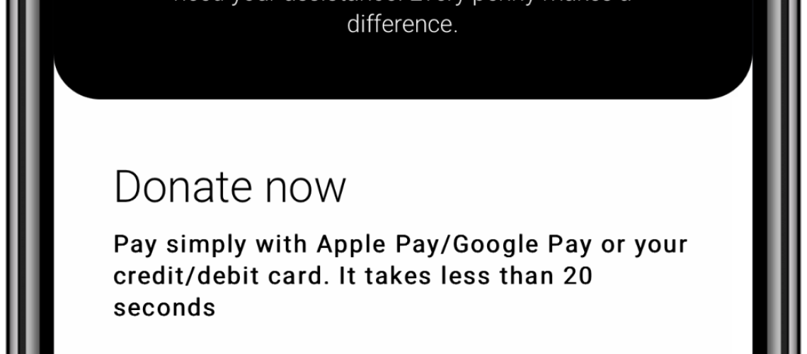
Donater online donation pages enable donors to make donations using Google Pay and Apple Pay, making mobile payments quick and easy. - Creating the donation page itself
Your donation page is a vital extension of your charity and needs to be both functional as well as visually attractive. Your page should reflect your charitable organisation and be as on-brand as possible so that donors trust they have landed in the right place, and their money is going direct to you.
Donater online donation pages are designed with your charity in mind, seamlessly integrating your vision, worthy case and style with the digital means to accept online donations. - Make online donations easily accessible
Embedding a Donate Now button on your website makes your online donation page as easy to access as possible. This should be available across the entirety of your website, so that whenever a potential donor feels moved to make an online donation, the button is there, obvious and ready. - Be Concise
Your online donation page should be as concise as possible, and definitely be on one page only. You should try to avoid having forms that go over multiple pages to reduce the possibility of donors getting fed up and not getting to the end. The more straightforward and concise the better – You’re more likely to get a higher success rate.


